Welcome to vInformation – the blog dedicated to the visualization of information!
The first blog entry shows the distribution of world’s population – by latitude and longitude. It’s clearly visible that the northern hemisphere outweighs the southern hemisphere by population (as well as the eastern hemisphere does outweigh the western hemisphere), but take into consideration that the northern hemisphere accounts for almost 70% of earth’s landmass. Yet the chart points to the most populated countries: China and India.
There is also a nice 3D-Globe, showing population by columns: http://workshop.chromeexperiments.com/globe/
——————–
Willkommen auf vInformation, ein Blog der sich der Visualisierung von Informationen widmet!
Der erste Eintrag dieses Blogs zeigt die Verteilung der Weltbevölkerung nach Längen- und Breitengrad. Es lässt sich klar erkennen, dass die Bevölkerung der Nordhalbkugel wesentlich größer ist als die der Südhalbkugel. Das liegt aber auch an der ungleichen Verteilung der Landfläche, fast 70% der Landfläche der Erde liegt auf der Nordhalbkugel. Dennoch gibt die Grafik einen Hinweis auf die bevölkerungsreichsten Länder: China und Indien.
Es gibt auch eine schöne 3D-Animation der Erde, mit der Bevölkerung als Säulen: http://workshop.chromeexperiments.com/globe/
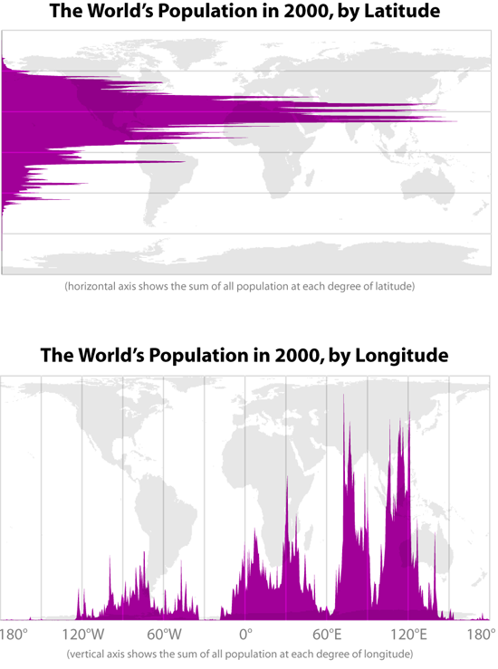
The world’s population by latitude and longitude – © radicalcartography.net
